




A conversion-focused homepage does one job: it gets the right visitor to take the next step, whether that is a call, a quote request or a booked consultation. It does that by stating what you offer in the first screen, giving one prominent action, and backing it with proof and clear paths below. Video, when it is done well, is one of the strongest ways to carry that message. Below is how to plan each part, with the mistakes that cost most businesses leads.
TL;DR
- Pick one primary action for the homepage before you design anything, then make everything else support it.
- The first screen needs a headline, a supporting sentence, one visual and one clearly labeled call to action.
- Use specific button labels, visible navigation and trust signals near the action.
- Hero video should be silent on autoplay, captioned and never block the call to action. Check the mobile view first.
- Measure the homepage against its single goal and test one change at a time.
Table of Contents
- Start with one goal
- What belongs above the fold
- Write calls to action that say what happens next
- Structure the rest of the page
- Use video without hurting the page
- Design for the phone first
- Reduce friction at the moment of contact
- Measure and improve
- Where we come in
- Our perspective
- FAQ
- Sources
Start with one goal
Before choosing colors or photos, decide the most valuable action a visitor can take. CXL’s guidance on designing a homepage that converts is to identify the most-wanted action and guide people to a next step that fits their needs and readiness, using buyer personas to understand their hesitations.
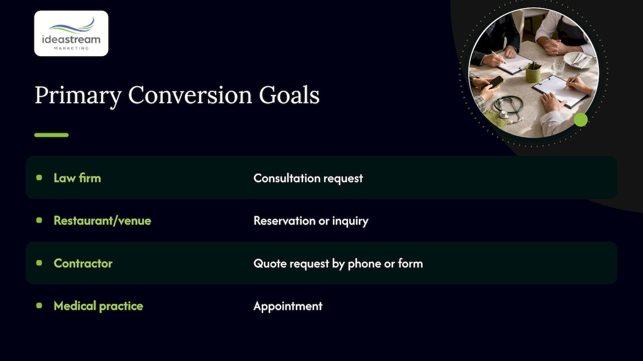
For a Long Island law firm, that action is usually a consultation request. For a restaurant or event venue it may be a reservation or inquiry. For a contractor it is a quote request by phone or form. For a medical practice it is an appointment. Write that goal in one sentence. If you cannot, the page will try to do five jobs and do none well.
Visitors arrive at different levels of readiness. A first-time visitor may not be ready to call, so a secondary step such as watching a short video or viewing recent projects gives them somewhere to go. Keep that secondary step visually quieter than the main one.
What belongs above the fold
“Above the fold” is the part of the page visible before anyone scrolls. HubSpot’s guide describes it as the header, text, imagery or video seen first, and says it should convey what the organization does and the benefit. Mailchimp’s guidance lists the same core pieces: a headline, supporting content, a relevant visual and a call to action, without too much detail.
That gives you a simple checklist for the first screen:
- A headline that names the outcome. “Estate planning attorneys serving Suffolk and Nassau County” beats “Welcome to our firm.”
- One supporting sentence. Say who you help and how, in plain words.
- One visual. A real photo of your team, your work or a short video. Stock imagery tells visitors nothing.
- One primary call to action. A button or phone number, easy to see on a phone.
- A quick trust cue. A review rating, a license, a years-in-business line or a client logo row.
The Nielsen Norman Group’s homepage design principles add a balance: put the most important content as high as possible so it stays visible across device sizes, but design the layout so people still want to scroll. The fold is not a wall. It is where the visitor decides whether the page is for them.
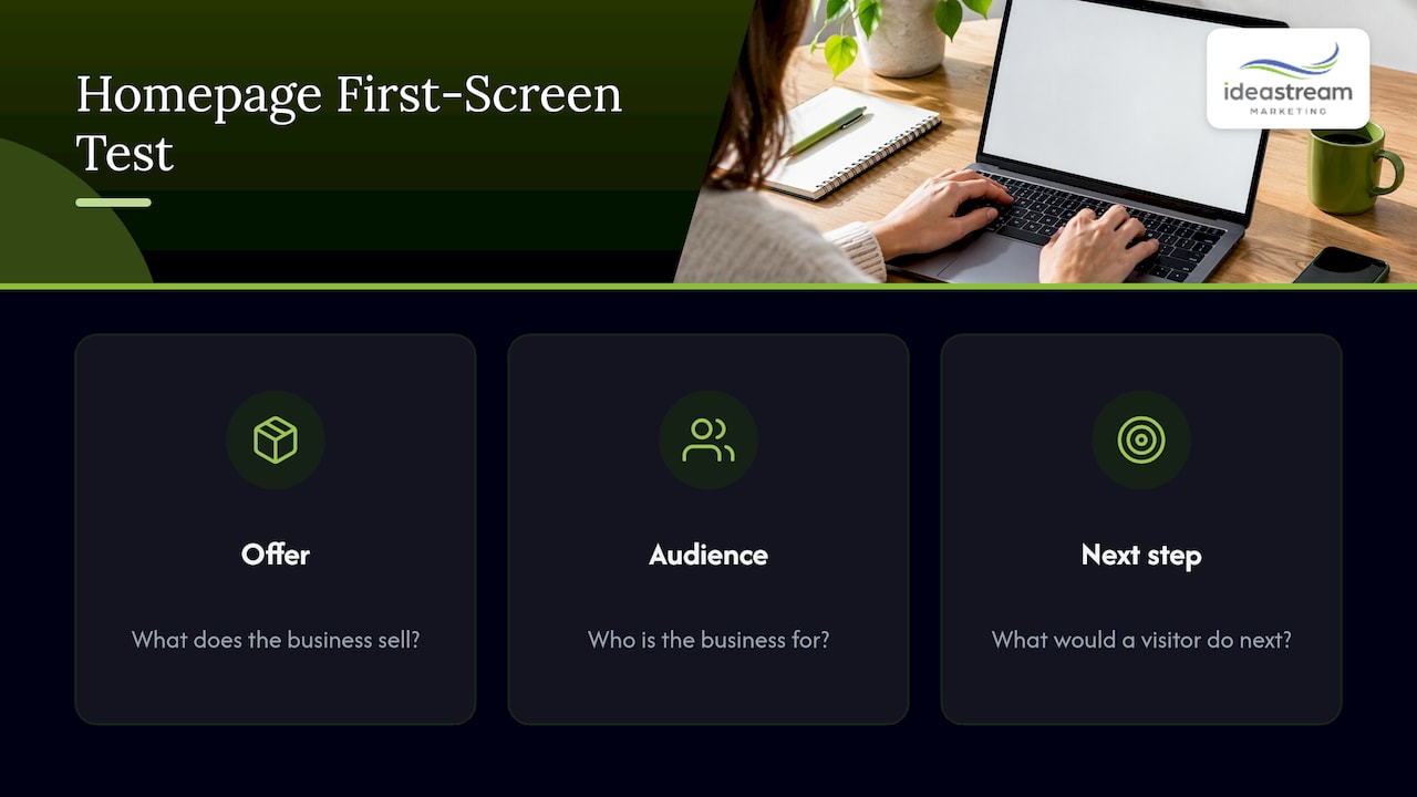
A quick test for your first screen
Show the page to someone unfamiliar with your business for five seconds, then ask what you sell, who it is for and what they would do next. If any answer is wrong or missing, the headline or visual needs work.
Write calls to action that say what happens next
The button label carries more weight than most owners assume. NN/G recommends clear, descriptive labels and notes that generic ones such as “Click Here,” “Explore” or “Learn More” do not tell users what they will get. CXL recommends benefit-oriented wording that signals what happens after the click, and advises testing the language rather than assuming one phrase wins.
Compare these:
| Generic label | Specific label |
|---|---|
| Submit | Request my free quote |
| Learn more | See our video production work |
| Contact us | Schedule a consultation |
| Get started | Book a studio session |
Keep the high-priority action visually dominant. If your header has eight links and three buttons of equal weight, nothing is a priority. NN/G’s advice is to give important tasks visual prominence and to prioritize content by what visitors need most, rather than giving every link and section equal weight.
Structure the rest of the page
What sits below the first screen should answer the questions a ready-but-cautious buyer asks, in roughly this order:
- What exactly do you do? Three to six services, each with a one-line description and a link to its own page.
- Why should I trust you? Reviews, case results, certifications, guarantees and recognizable clients. CXL recommends trust marks and visible contact information to reduce friction.
- What is it like to work with you? A short, numbered process lowers the fear of the unknown.
- Where are you and who do you serve? For local businesses, name your towns and counties and show your Google Business Profile details. Our guide to local landing pages covers how to extend this to each location you serve.
- What do I do now? Repeat the primary call to action at the bottom so nobody has to scroll back up.
Internal links matter here too. Every service block should lead to a page that goes deeper, and a sound internal linking strategy helps both visitors and search engines understand how your pages relate.
Use video without hurting the page
Video can show your team, your space and your results faster than a paragraph. It is also easy to get wrong. The guidance from NN/G and HubSpot points the same way:
- Use one featured image or video above the fold, not a carousel of competing items.
- Autoplay only if the video is silent, and do not let it interrupt interaction.
- Add captions and give visitors sound controls.
- Autoplaying moving content that lasts longer than five seconds needs a pause or stop option, per the accessibility guidance NN/G cites.
A good hero video is short, shows real people and real work, and ends on or sits beside the call to action. A 30 to 60 second brand video on the homepage can introduce your team, while short clips cut from longer interviews or podcast episodes can fill service sections. The same footage can then be repurposed as Instagram Reels, Facebook Reels, TikToks and YouTube Shorts, so one shoot feeds the homepage and your social channels. For planning, see our video content checklist and video marketing strategies.
If you publish video, also think about how it is found. Our video SEO best practices explain how to make that footage discoverable in Google and on YouTube.
Design for the phone first
Many local searches happen on phones, so the mobile first screen is often the only one a visitor sees. Keep the headline, button and phone number high on the page, use a clear visual hierarchy, and make tap targets large enough to hit. A heavy hero video that stalls on a cellular connection costs more than it earns.
A responsive layout is the baseline. Read more in our pieces on responsive web design and building a mobile-friendly site. Accessibility belongs in the same conversation: contrast, readable text, keyboard navigation and captions help every visitor and widen your audience. Our accessibility guide lays out a practical plan.
Reduce friction at the moment of contact
The last obstacle is usually the form or the follow-up. Ask only for what you need to respond: name, email or phone, and a short message. Confirm submission on screen and by email, and reply fast. If you automate confirmations or route inquiries to a sales team, deliverability matters, because a confirmation that lands in spam undermines the trust the page built. Teams that run outreach or auto-replies through software agents can look at agent mailboxes for sales outreach to keep sending and receiving organized. For more on turning inquiries into customers, see our lead generation best practices.
If visitors arrive from ads, send them to a dedicated page rather than the homepage. Our PPC landing pages guide explains why a focused page converts a paid click better than a general one.
Measure and improve
Define success as the homepage’s single goal: form submissions, calls, bookings. Track it, then change one element at a time, such as the headline, the button label or the hero image, and compare results over a long enough period.
Patience matters. A published case study of a nonprofit’s responsive homepage redesign reported a 21-day A/B test with a 2% lift in sponsorship conversions and a 4.8% lift in revenue, yet the author noted those differences were not statistically valid. The lesson for a small-business site with modest traffic is to run tests until the result is reliable and not to declare a winner after a few days. Our overview of conversion optimization strategies and our approach to data-driven web design go further.
Where we come in
We are a Long Island agency that designs and develops websites, produces video and podcasts, and handles SEO and AI search optimization. Every video and strategy we develop is built for visibility in Google, AI search, YouTube and social platforms. For a homepage, that means the copy, hero video, structure and search optimization are planned together instead of handed off between vendors.
If you want a homepage that turns visits into inquiries, talk to our team about website design and development and schedule a consultation or a studio session.
We also produce Long Island video, podcast episodes and short-form reels from the same shoot, so the homepage video and your social content share one production day.
Our perspective
Most homepages fail for a simple reason: they describe the company instead of answering the visitor. When we plan a site, we start with the one action the business wants, then ask what a skeptical buyer needs to see to take it.
We believe video is the fastest way to build that trust, because people see your team and your work before they ever call. That is why we plan video, web design and search optimization together. A hero video, a podcast clip and a Reel should all come from one strategy and all point visitors back to the same clear next step.
The fold is the starting line, not the finish. Get the first screen right, then keep earning attention all the way down the page.
Dean Spinato, CEO & Founder of Idea Stream Marketing
FAQ
What is above the fold content?
It is everything visitors can see on a page before scrolling. It should state what you offer, the benefit and the next step, usually with a headline, a short supporting line, one visual and a call to action.
Does everything important have to be above the fold?
No. Put the most important message and action there, then invite scrolling with supporting sections below. People do scroll when the first screen shows them the page is relevant.
Should my homepage have an autoplay video?
Only if it is silent, captioned and does not interrupt interaction. Moving content that autoplays for more than five seconds needs a pause or stop control. Make sure it never pushes the call to action out of view on a phone.
How many calls to action should a homepage have?
One primary action, repeated where it makes sense, plus at most one quieter secondary option for visitors who are not ready. Use specific labels such as “Schedule a consultation.”
How do I know if my homepage is working?
Track the number of calls, form submissions or bookings against visits, then test one change at a time and wait for a reliable result before keeping it.
Sources
- How to Design a Home Page That Converts, CXL
- Homepage Design: 5 Fundamental Principles, Nielsen Norman Group
- 18 Above the Fold Content Examples, HubSpot
- Tips for Designing Above the Fold Content That Converts, Mailchimp
- Case Study: Compassion.com Homepage, Kristen Shaw

