



October 7, 2026



A PPC landing page is a dedicated page tied to a single paid ad, built to complete one conversion action rather than inform or entertain. Its only job is to turn a paid click into a lead, sale, or signup, and the single most useful thing you can check right now is whether your ad’s headline matches your landing page’s headline word for word.
TL;DR:
- A dedicated landing page should have a headline that matches the ad’s headline exactly to improve relevance and conversions.
- The page must focus on a single message and clear call to action, with key elements like hero sections, proof, and a simple form or booking widget.
- Loading times under three seconds and optimized Core Web Vitals are critical, especially on mobile, to prevent visitor drop-off and reduce ad costs.
- Precise message match, clear hero composition, and trust signals located near the CTA significantly increase conversion rates.
- Scaling to many landing pages is cost-effective only if traffic volume justifies it; otherwise, templated pages with dynamic swaps are preferable.
Table of Contents
- What Is a PPC Landing Page and When Do You Need One
- Examples and Templates You Can Adapt Today
- Design and Copy Rules That Actually Move Conversion Rates
- Page Speed and Core Web Vitals Fixes That Protect Your Ad Spend
- How Landing Pages Affect Quality Score and Conversion Tracking
- A Testing Plan for Continuous Landing Page Optimization
- Dynamic and Personalized Pages: When They’re Worth the Complexity
- Practical Fixes We Apply to Underperforming Landing Pages
- When to Scale to Many Landing Pages Versus a Smaller Templated Set
- How Idea Stream Marketing Can Help You Build Pages That Convert
- FAQ
- Sources
What Is a PPC Landing Page and When Do You Need One
A PPC landing page differs from a standard website page in one critical way: focus. Your homepage or service page has navigation, multiple calls to action, and content meant to serve many types of visitors. A dedicated landing page strips that away. There’s one message, one offer, and one button, because every visitor arrived from the same ad with the same intent.
Landing pages are often built whenever a campaign has a specific, measurable goal that a general website page can’t isolate. That includes:
- Lead generation campaigns collecting contact information in exchange for a quote, consultation, or resource.
- Product promotions driving traffic to a single offer or seasonal discount.
- Trial signups for software or subscription services where friction has to stay low.
- Event registration pages built around a date, location, and single registration form.
- Local service booking pages that connect a specific service area to a phone call or appointment request.
The trade-off is maintenance. A dedicated landing page takes more setup time than pointing an ad at an existing page, and it needs regular updates as offers change, copy ages, or Core Web Vitals scores drift. In exchange, you get control over message match and far cleaner conversion data, since nothing on the page competes with your campaign goal. For most paid search and paid social budgets, that trade is worth making, especially once your Google Ads management spend crosses a few thousand dollars a month and page performance starts to directly affect cost per acquisition.
Examples and Templates You Can Adapt Today
Rather than describe landing pages in the abstract, here are five models built around common campaign types, each with the one element that carries the most conversion weight.
- Lead generation (professional services). Goal: capture name, email, and phone number in exchange for a consultation. Key element: a short form above the fold with no more than four fields.
- E-commerce promotion. Goal: drive a single product or bundle purchase. Key element: a product image with price, discount, and an “add to cart” button visible without scrolling.
- SaaS trial signup. Goal: get an email address and start a free trial. Key element: a headline stating the specific outcome the software delivers, not a feature list.
- Event registration. Goal: fill seats for a webinar, open house, or in-person event. Key element: date, time, and location stated in the first screen, with a countdown or limited-capacity note if true.
- Local service booking. Goal: generate a phone call or scheduled appointment. Key element: a click-to-call button paired with the service area named explicitly.
Every one of these pages shares a common structural template, and building to this checklist saves time whether you’re working in a page builder or handing specs to a developer:
- Hero section with headline, subhead, and primary CTA visible without scrolling.
- Value proposition block stating the specific benefit, not generic claims.
- Proof section with testimonials, client logos, or review counts.
- Primary CTA repeated at least once more below the fold.
- Form or booking widget sized to the offer’s complexity.
- Post-conversion flow including a thank-you page and confirmation message.
For quick builds, tools like Unbounce, Instapage, and Leadpages handle the layout mechanics, while a simple one-column design outperforms multi-column layouts for most mobile traffic because it removes decision points. Keep copy snippets short and testable: a headline like “Get a Free Quote in 24 Hours” gives you something concrete to test against a benefit-led alternative like “Stop Overpaying for [Service].” If your campaign supports it, a short video replacing a static hero image often raises time on page, a tactic we cover in more depth in our video content checklist.
Design and Copy Rules That Actually Move Conversion Rates
Message match is the single highest-leverage fix most campaigns are missing. If your ad says “Same-Day HVAC Repair,” your landing page headline should say the same thing, not a broader phrase like “HVAC Services You Can Trust.” Google’s own landing page experience guidance treats this alignment as a direct signal of relevance, and a mismatch here is one of the fastest ways to lose both Quality Score and conversions in the same move.
Hero composition matters almost as much as the words in it. A single-column layout that states one tangible benefit, backed by a supporting proof point (a number, a guarantee, or a client name), outperforms pages that try to communicate three ideas at once. Visitors scanning a paid landing page decide whether to stay within seconds, so clarity beats cleverness every time.
A few rules we apply consistently when building landing pages for clients:
- CTA buttons use action verbs (“Get My Quote,” “Start My Trial”) instead of passive phrases like “Submit.”
- Color contrast on buttons follows accessibility standards so the CTA is visible to visitors with low vision.
- Urgency is used only when true: a real deadline or limited inventory, never a fake countdown.
- Trust signals appear near the CTA, not buried at the page bottom where they go unseen.
- Testimonials are real and attributed, never written in-house and labeled as customer quotes.
That last point carries legal weight. The FTC’s Endorsement Guides require that testimonials and endorsements be truthful, non-misleading, and clearly disclosed, and the agency’s updated Consumer Reviews and Testimonials Rule sharpens the penalties for fabricated or misleading social proof. If you’re adding client quotes or review scores to a landing page, keep the sourcing documented and the wording unedited from what the customer actually said.
Form design is where many otherwise strong landing pages lose conversions. Every field you add past the essentials reduces completion rate, so match field count to offer value: a free guide can ask for just an email, while a sales consultation can justify a phone number and company name. Use the correct input type for each field (a numeric keypad for phone numbers on mobile, not a full keyboard), add inline validation so errors show before submission instead of after, and keep the form thumb-friendly on mobile with generously sized tap targets. Our own guidance on form UX for lead generation goes deeper on field sequencing if you’re rebuilding a form from scratch.
Pro Tip: Put your strongest proof point, whether it’s a client count, a star rating, or a guarantee, directly beside your CTA button rather than in a separate section further down the page.
Page Speed and Core Web Vitals Fixes That Protect Your Ad Spend
A large share of mobile visitors abandon a page that takes longer than three seconds to load. A one-second delay can significantly reduce conversions in some retail contexts, according to Google’s mobile speed guidance. When you’re paying for every click, a slow landing page is the same as throwing away ad spend before the visitor even sees your offer.
Google evaluates page performance using Core Web Vitals: Largest Contentful Paint (LCP), Cumulative Layout Shift (CLS), and Interaction to Next Paint (INP). Google’s PageSpeed Insights documentation sets the passing bar at the 75th percentile of page loads meeting the “Good” threshold for all three metrics. A page that loads fast for most visitors, but stalls for a meaningful share of mobile users on slower connections, still fails this benchmark.
The fixes that produce the most improvement per hour of work, in rough priority order:
- Compress and resize images before upload rather than relying on the browser to scale them down.
- Defer non-critical JavaScript so the page becomes interactive before every script finishes loading.
- Use a CDN to serve static assets from servers closer to the visitor.
- Preconnect to third-party domains your page depends on, such as font providers or tracking scripts.
- Optimize server response time on the hosting side, since a slow backend undermines every front-end fix.
If you’re adding short-form video to a hero section, compress it specifically for mobile delivery, autoplay it muted, and use a poster image so the layout doesn’t shift once the video loads, a common cause of poor CLS scores.
Test your pages with PageSpeed Insights, Lighthouse in Chrome DevTools, and Google’s Test My Site tool, which evaluates mobile speed specifically and suggests fixes ranked by expected impact. Track your LCP, CLS, and INP scores monthly rather than once at launch, since adding new scripts, images, or third-party tags over time tends to erode performance gradually.
How Landing Pages Affect Quality Score and Conversion Tracking
Quality Score is calculated per keyword on a 1 to 10 scale from three components: expected clickthrough rate, ad relevance, and landing page experience. A strong ad with a weak landing page still drags the overall score down, which raises your cost per click and can limit how often your ads show. Treat landing page experience as a diagnostic rather than a vanity number: if Google flags it as “Below Average,” the fix is almost always content relevance or page speed, not the score itself.
Accurate conversion tracking is what makes every optimization decision after this point meaningful. The cleanest path is to create key events in Google Analytics and import them into Google Ads as conversions, which keeps your data consistent across both platforms and feeds Smart Bidding strategies with reliable signals. We’ve written a more detailed walkthrough of this setup in our guide to Google Ads conversion tracking, including how to avoid duplicate conversion counting, a mistake that inflates reported performance and misleads bidding algorithms.
Once tracking is live, the Landing Pages report inside Google Ads gives you per-URL visibility into:
- Mobile-friendly click rate, flagging pages that underperform on phones specifically.
- Valid AMP click rate, relevant if you’re running accelerated mobile pages.
- Clicks, impressions, and CTR broken out by landing page URL rather than campaign.
Beyond the platform report, track conversion rate, cost per acquisition, bounce rate by landing page, and mobile-friendly click rate as your core recurring KPIs. Reviewing these weekly during an active campaign catches problems before they become expensive.
A Testing Plan for Continuous Landing Page Optimization
Testing without a hypothesis wastes traffic. Before launching any A/B test, write down what metric you expect to move and why: “Changing the CTA from ‘Submit’ to ‘Get My Free Quote’ will raise form completion rate because it states the benefit explicitly.”
A workable testing cadence looks like this:
- Pick one variable per test. Testing a headline and a CTA color at the same time makes it impossible to know which change drove the result.
- Run tests long enough to reach statistical significance, which usually means waiting for enough conversions on each variant rather than stopping after a few days.
- Prioritize tests by expected impact: headline and message match first, CTA copy and button design second, hero image or video third, form length fourth, and page speed improvements as an ongoing parallel track.
- Document every result, win or loss, so you’re not re-testing the same idea six months later.
The most common mistake we see is ending tests too early because one variant looks like it’s winning after a small sample. A result that looks strong after 20 conversions can reverse completely by 200. The second most common mistake is testing low-impact elements, like font choice, while ignoring page speed issues that are suppressing every variant’s performance equally. Our broader conversion optimization framework covers prioritization in more depth if you’re building a testing roadmap from scratch.
Pro Tip: *Run your highest-priority test on your highest-traffic campaign first.
Dynamic and Personalized Pages: When They’re Worth the Complexity
Dynamic landing pages swap headline text, images, or offers based on the keyword, ad, or UTM parameter that sent the visitor, pushing message match closer to perfect for every click. The overhead is real: more pages means more QA, more tracking configuration, and more opportunities for something to break silently.
Common technical patterns include query-string injection that swaps text based on URL parameters, server-side templates that render different content by segment, and JavaScript-based swaps that update the page after it loads. Each comes with a QA checklist: verify every dynamic variant renders correctly on mobile, confirm conversion tracking fires consistently across all variants, and check that fallback content displays properly when a parameter is missing or malformed.
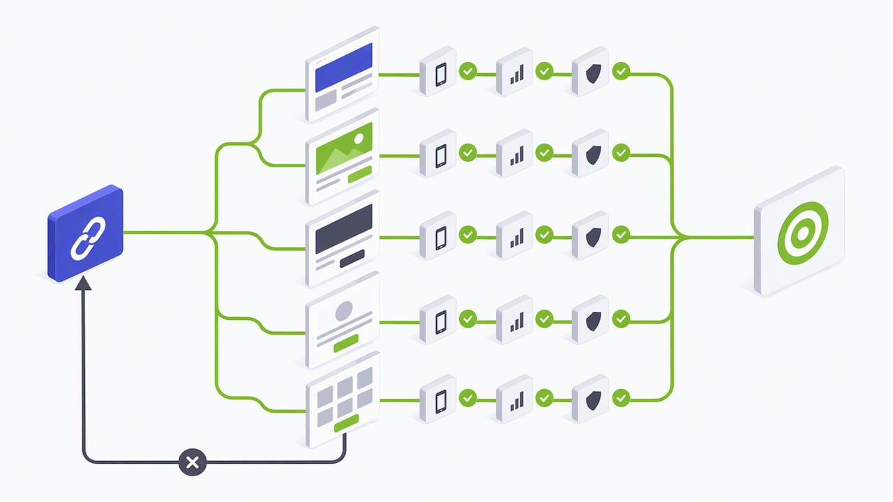
For most advertisers, a hybrid model works best: a small number of high-traffic, fully tailored pages for your top keywords or ad groups, with lightweight dynamic swaps reserved for lower-volume terms where building a dedicated page isn’t worth the effort. A single well-built tailored page still outperforms a poorly QA’d dynamic system, so don’t reach for personalization at scale before your tracking and QA process can support it.
Practical Fixes We Apply to Underperforming Landing Pages
Most landing page problems we encounter fall into three buckets: slow load times, ad-to-page mismatch, and broken or incomplete conversion tracking. Fixing those three before touching copy or design usually produces the biggest jump in performance.
A few specific wins worth testing on your own pages:
- Replace a static hero image with a short, compressed video showing the product or service in action, a tactic that tends to raise time on page when done right, as outlined in our video in advertising guide.
- Pre-fill form fields using ad or UTM parameters when the data is already known, reducing friction for the visitor.
- Audit conversion tracking for duplicates before trusting any A/B test result, since inflated conversion counts skew every decision downstream.
If you’re running PPC campaigns and want a second set of eyes on where the page is losing visitors, our PPC strategy guide breaks down the connection between campaign structure and landing page performance in more detail. Teams building out a broader lead funnel often benefit from reviewing both the ad account and the page together rather than optimizing either in isolation.
When to Scale to Many Landing Pages Versus a Smaller Templated Set
The decision between dozens of micro-landing pages and a handful of well-built templates comes down to traffic volume and staffing. If a specific keyword or ad group drives enough volume to justify its own page, meaning you can reach statistical significance on tests within a reasonable window, a dedicated page earns its keep. Below that threshold, a templated page with light dynamic substitution covers the message match gap without the QA burden of maintaining dozens of unique builds.
Staffing matters as much as traffic. Every additional landing page is another asset that needs speed monitoring, copy updates, and conversion tracking verification. A small in-house team managing twenty landing pages alongside other marketing work will see quality slip faster than a dedicated agency team built for that volume.
A quick gut check: if you’re spending more time maintaining pages than analyzing what they’re telling you about your campaigns, you’ve scaled past what your current setup can support.
How Idea Stream Marketing Can Help You Build Pages That Convert
If building, testing, and maintaining landing pages at this level of detail sounds like more than your team has bandwidth for, that’s exactly where we come in. We combine Google Ads management, landing page builds, and in-house video production for hero assets and testimonial content, all under one roof instead of across three separate vendors.
The studio produces short-form video and photography that go into high-performing hero sections, while the technical team handles speed optimization, conversion tracking setup, and diagnostics that keep ad spend working harder. Combining video production, podcast production, and digital marketing under one team allows clients building lead-gen landing pages to go from script to finished page without juggling separate agencies for creative and technical execution.
Services relevant to a landing page project include:
- Google Ads management covering campaign structure, bidding, and keyword strategy.
- Landing page design and build, including speed optimization and mobile testing.
- Video production for hero sections, testimonials, and product demonstrations.
- Conversion tracking setup connecting Google Analytics events to Google Ads.
If you’re ready to put these practices to work on a real campaign, schedule a consultation with our team and we’ll walk through what a dedicated landing page could do for your current paid ad spend.
FAQ
How much should I pay for a landing page?
Pricing varies widely based on design complexity, copywriting, and whether video or custom development is involved, so there’s no single industry-standard figure. Agencies typically quote landing page builds as part of a broader campaign or website project rather than a standalone flat fee, and our own pricing is available on request based on project scope.
What does SEO and PPC mean?
SEO, or search engine optimization, is the practice of improving a website’s visibility in unpaid search results. PPC, or pay-per-click, is paid advertising where you pay a fee each time someone clicks your ad, and the two strategies often work together since PPC landing pages benefit from the same speed and relevance factors that SEO rewards.
What is the best platform for landing pages?
The right platform depends on your existing website setup and team’s technical skill, with options ranging from dedicated builders like Unbounce and Instapage to custom-built pages on a WordPress site. For businesses already running on WordPress, a custom-built page integrated with existing tracking often performs better long-term than a bolt-on third-party tool.
What does Google PPC stand for?
Google PPC stands for Google Ads pay-per-click advertising, the auction-based system where advertisers bid on keywords and pay only when a user clicks their ad. Landing page experience is one of three factors Google uses to calculate Quality Score for each keyword in that system.
Sources
- About PageSpeed Insights (Core Web Vitals) – Google Developers
- Endorsements: Guide for advertisers – Federal Trade Commission